Interactive Bulletin Board
Toolkit: Figma, Google Workspace
Responsibilities: User Research, Concept Development, Hypothesis Development, Journey Mapping, Mobile Widget Design, Video Production
Team: Ella Kim, Sujin Han, Jayna Shah
Advisors: Stacie Rohrbach, Jasleen Arora
AI Citation: Some of the posters in the prototype were made using ChatGPT
Communication Design & Interaction Design
Bulletin boards have long been a part of campus communication, but the existing boards at Carnegie Mellon University often become cluttered, making it difficult for students to find relevant information. Their fixed layouts and physical placement also create accessibility challenges for members of the campus community.
As part of a team of three, we explored how bulletin boards could be reimagined to make campus communication more accessible, personalized and efficient. Our proposed solution is an interactive infrared screen that adapts to each user through personal space, intuitive gestures and accessible braille takeaways, while keeping the tangible feel of campus bulletin boards.
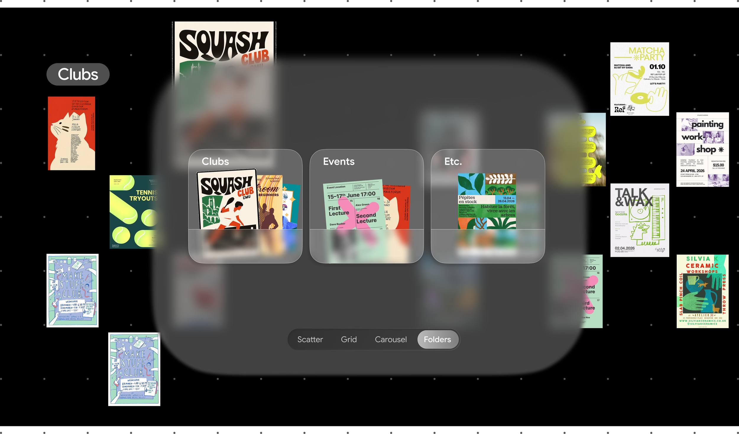
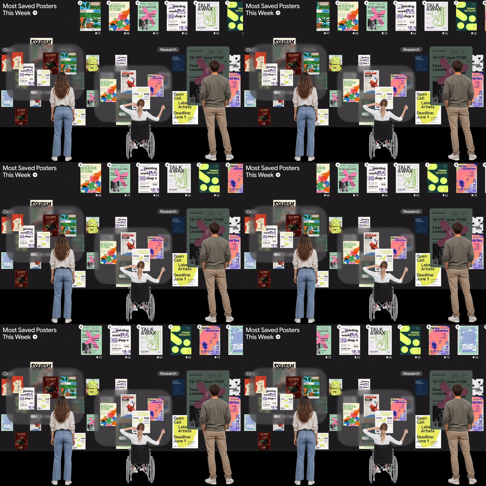
By tapping their student ID, users can activate a personalized space at eye level using infrared height sensing. The board automatically reshuffles its content to bring posters relevant to their interests closer, making information easier to find. Multiple people can interact with the board simultaneously, each with their own personalized space, while the remaining posters stay visible for everyone else to explore.
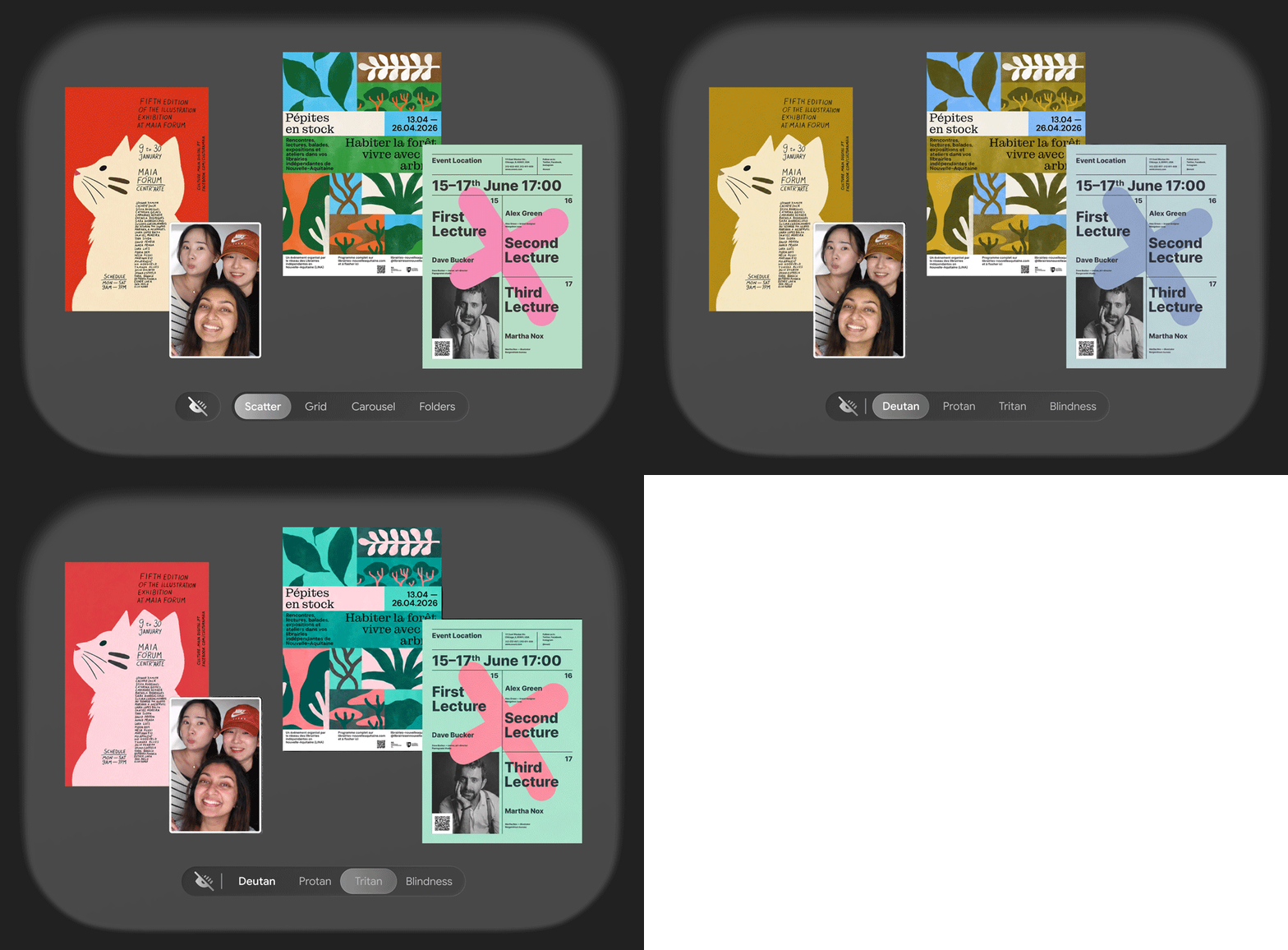
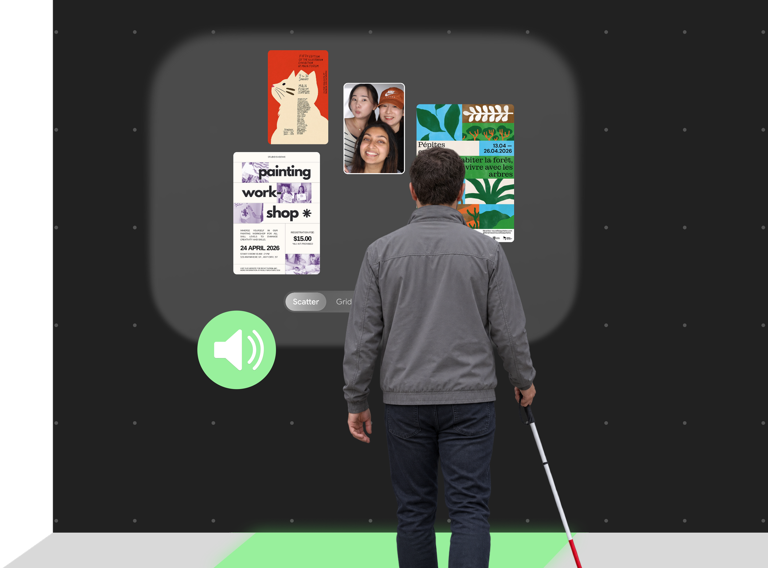
Accessibility was built into the experience from the moment a student taps their ID. The board automatically adjusts to their saved preferences, including color vision settings and text-to-speech, without requiring them to configure these features every time. Visually impaired students can navigate posters using audio and voice commands, while personalized color settings help make visual elements easier to distinguish. We also proposed a printer located beside the board that allows students to request pocket-sized braille versions of selected posters, making information accessible even after they leave the board.
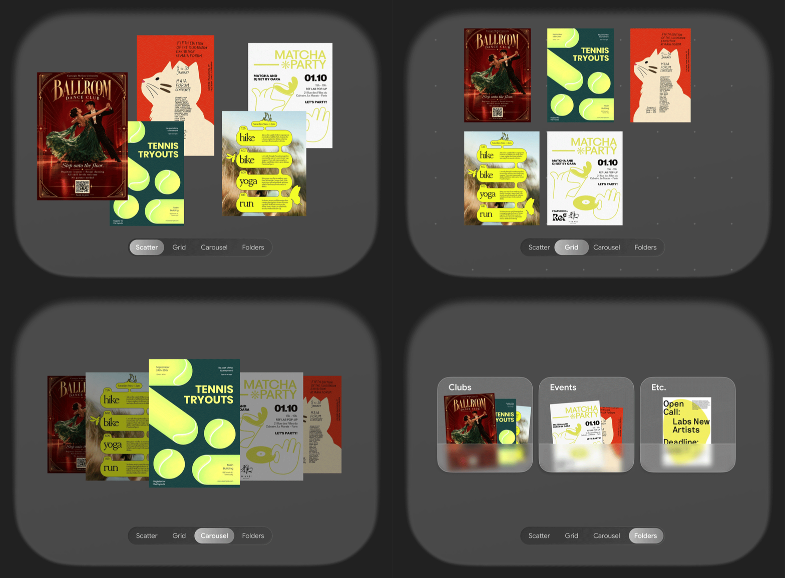
Through our interviews and surveys, we discovered that some students actually enjoyed the cluttered nature of traditional bulletin boards and felt it contributed to the campus aesthetic. Rather than removing that experience entirely, we introduced four viewing options. Students can choose between scatter, grid, carousel, and folders to explore posters in a way that works best for them, balancing the familiar feel of physical bulletin boards with more organized ways of finding information.
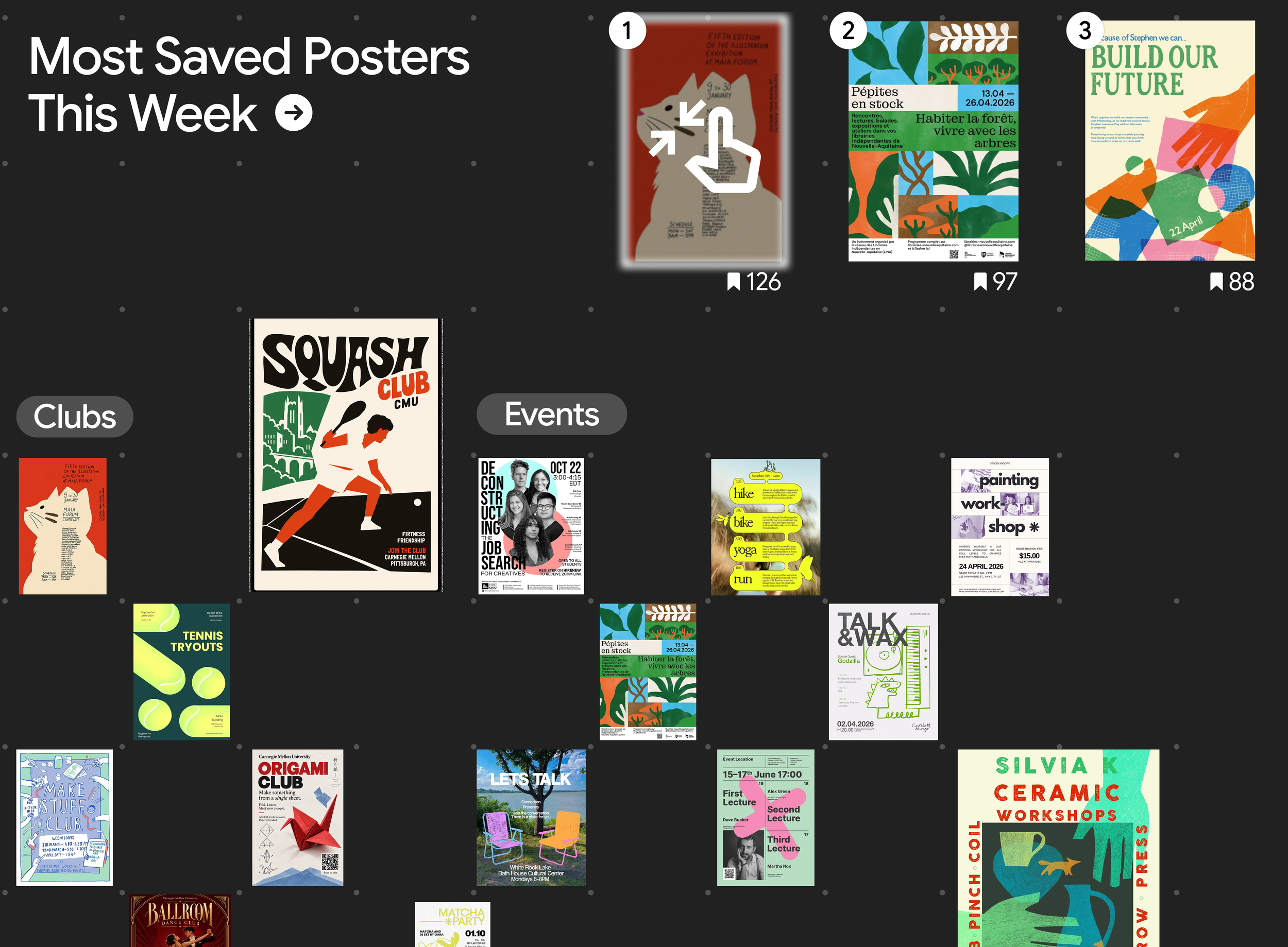
We also introduced gesture-based interactions to make it easier to engage with posters beyond physical reach. When someone points toward a poster in the moving ‘Most Saved Posters This Week’ section, the motion pauses and highlights their selection, allowing them to expand the poster for a closer look.
While we explored the possibility of creating an entirely mobile platform, we chose to preserve the physical bulletin board experience and the spontaneous interactions it encourages on campus. Instead, we designed two mobile widgets to complement the board and allow students to revisit information on the go.
The lock screen widget provides a quick shortcut to saved posters, while the home screen widgets organize content into personalized categories, such as clubs and events. This keeps students connected to campus activities.
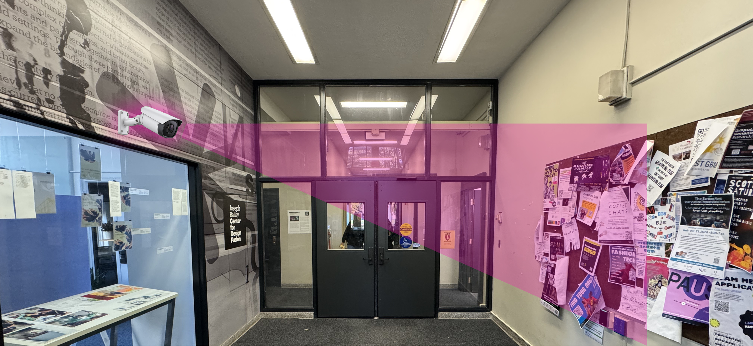
Rather than replacing traditional bulletin boards across campus, we proposed introducing one central interactive bulletin board at the Cohon University Center (CUC), bringing campus posters together in one place.
Students and organizations can continue putting up physical posters as they normally would. Cameras near existing boards would capture new posters and automatically add them to the interactive board. We also proposed a way for students to share posters directly from their phones when they're at the CUC.
We chose the CUC because it's a shared space that brings together students from across campus. The large, underutilized wall beside the Information Center offered enough room for multiple people to interact with the board at once, while its location along a busy walkway made it a natural place for discovery.
PROCESS
We mapped every type of communication at CMU and chose to focus on posters
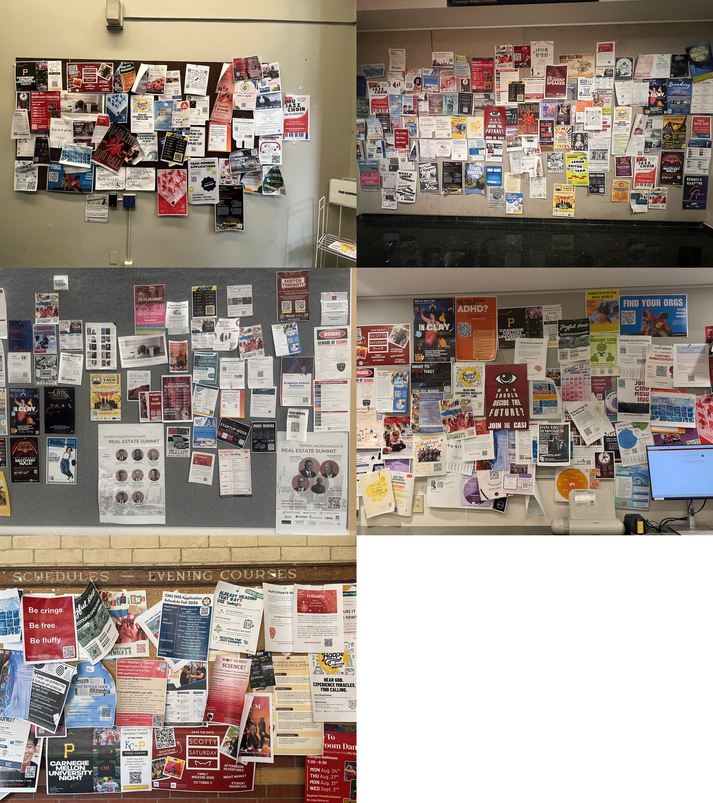
Existing Bulletin Boards at different locations across the entire Pittsburgh campus
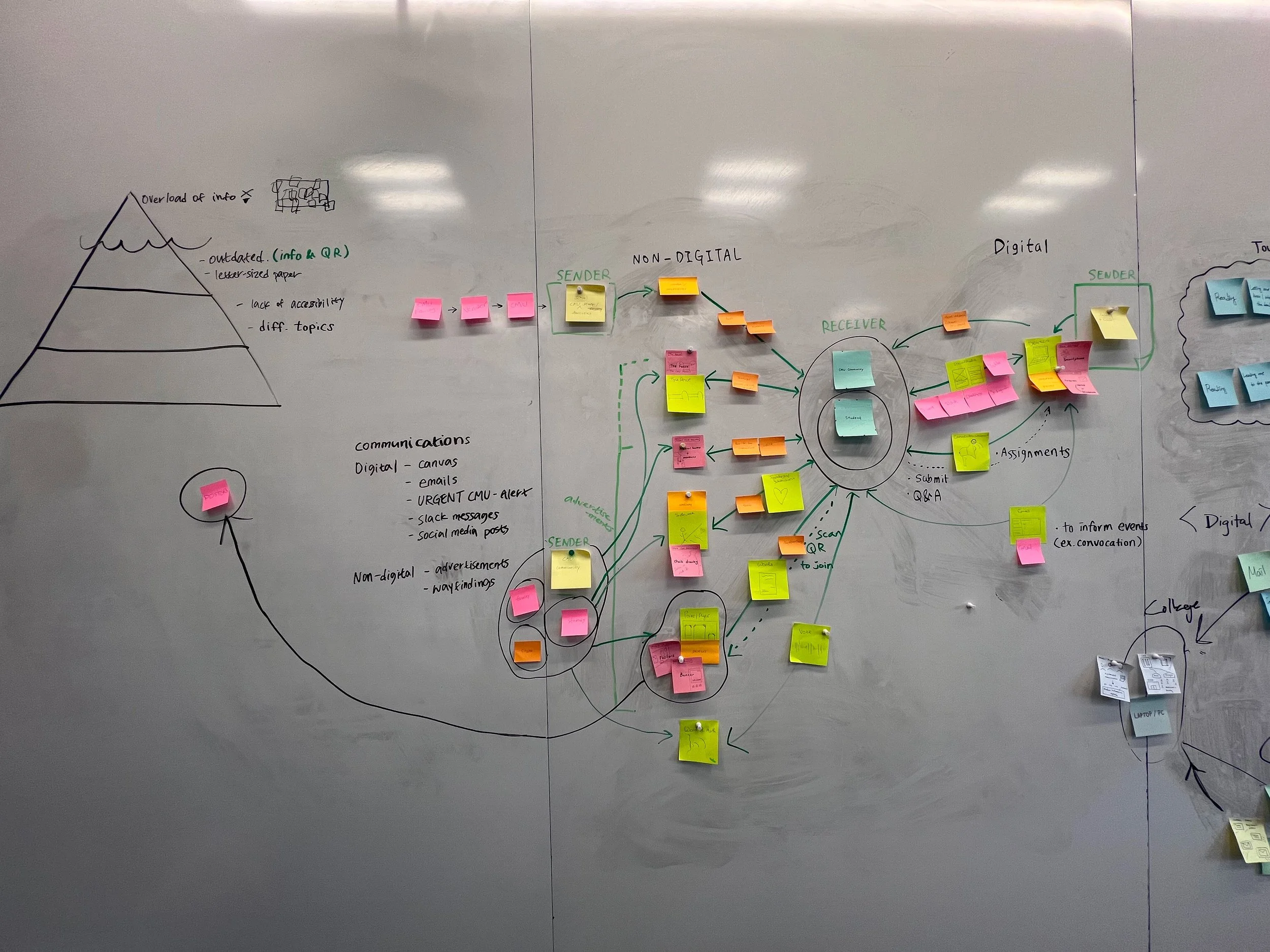
Mapping the Landscape
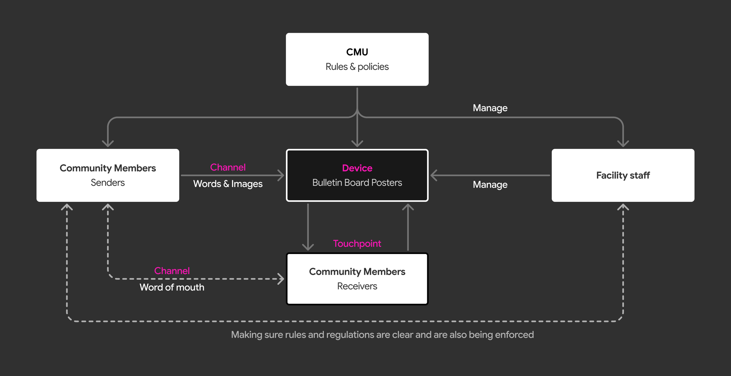
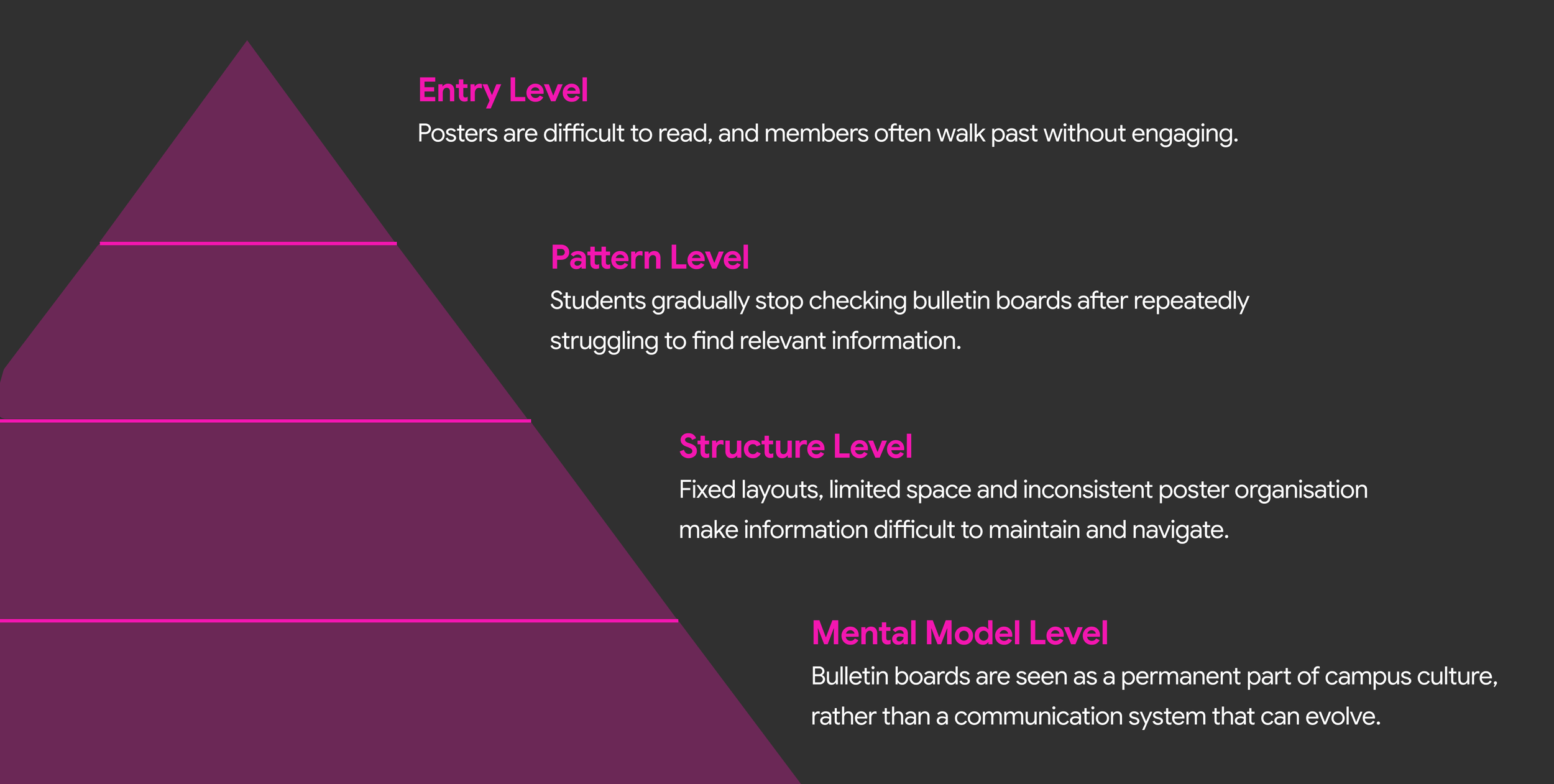
We mapped out nodes, devices and channels in depth to understand our stakeholders involved in this system. We learned about the iceberg model and how to use it to dig deeper into why our problem exists and understand the mental models behind it.
We grouped stakeholders into three categories: senders who wanted to post posters, facility staff who managed the boards, and CMU community members who viewed them. We interviewed the CUC Facility Director to gain a detailed understanding of how the boards were managed and the challenges staff faced. We also interviewed the disability officer to understand accessibility barriers for visually impaired students and those who use wheelchairs. Finally, we surveyed CMU students to gather data on their engagement with campus posters.
Research Findings
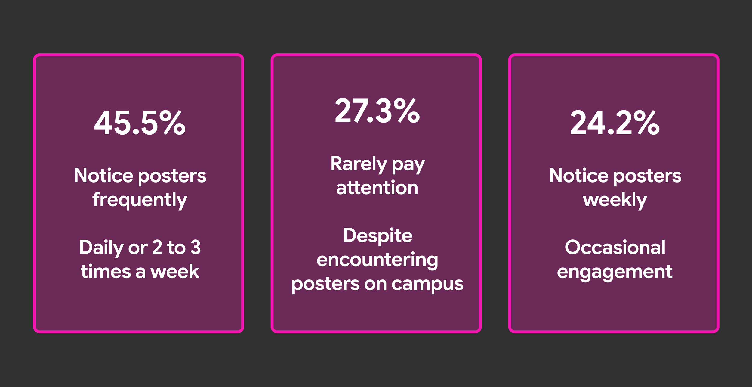
Our survey of 33 CMU students showed that students were interested in discovering clubs, events and career opportunities. However, our observations revealed a gap between interest and engagement. Most students simply glanced at the boards or walked past, while those who stopped were often drawn to bright colors, bold visuals or posters directly in their line of sight.
This made us realize that the challenge wasn't a lack of interest, but how easily people could find and interact with information. Combined with our findings on physical and visual barriers, we identified accessibility as a central issue. Information needed to be easier to discover, navigate and engage with, regardless of a student's abilities.
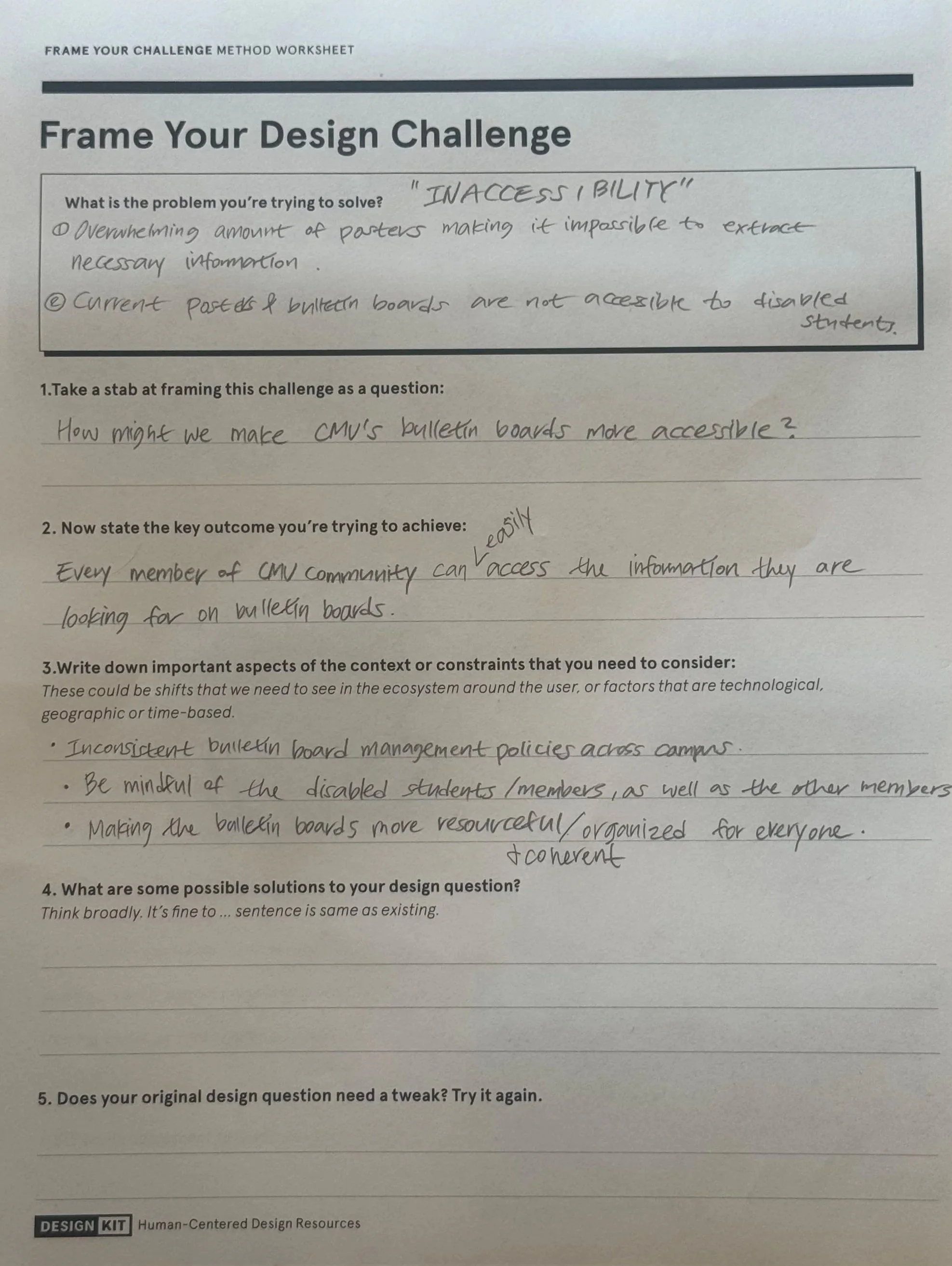
Framing the Challenge
Using IDEO's Frame Your Design Challenge worksheet, we brought our research findings together into one question.
How might we make CMU's bulletin boards more accessible?
Our hypothesis was that if we redesigned the bulletin boards to be more interactive and accessible, it would reduce clutter, aid navigation, and help all members of the campus community find important information more efficiently. We planned to do this through automatic categorization of posters by topic, personalized selections with a student ID, gestures, infrared height sensing, text-to-speech, and braille takeaways.
This became the foundation for our design decisions, helping us consider how information could be easier to discover, navigate and interact with.
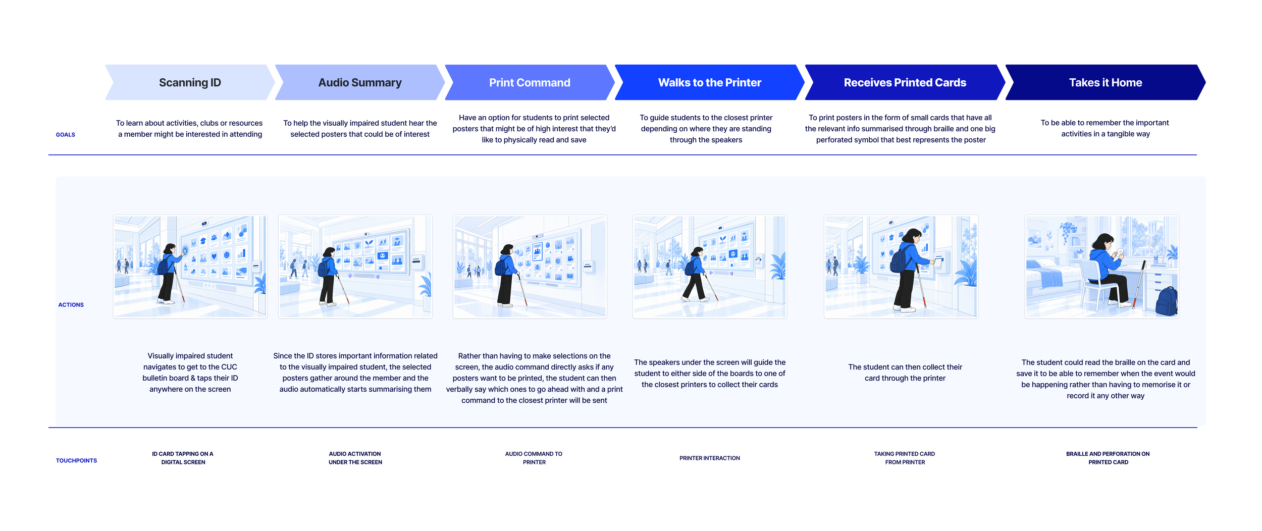
Visually Impaired Member Journey Map
We mapped out the experience of a visually impaired student interacting with our proposed bulletin board, from scanning their student ID and listening to audio summaries to receiving a printed braille takeaway. This helped us consider the different touchpoints involved and how students could navigate the experience independently.
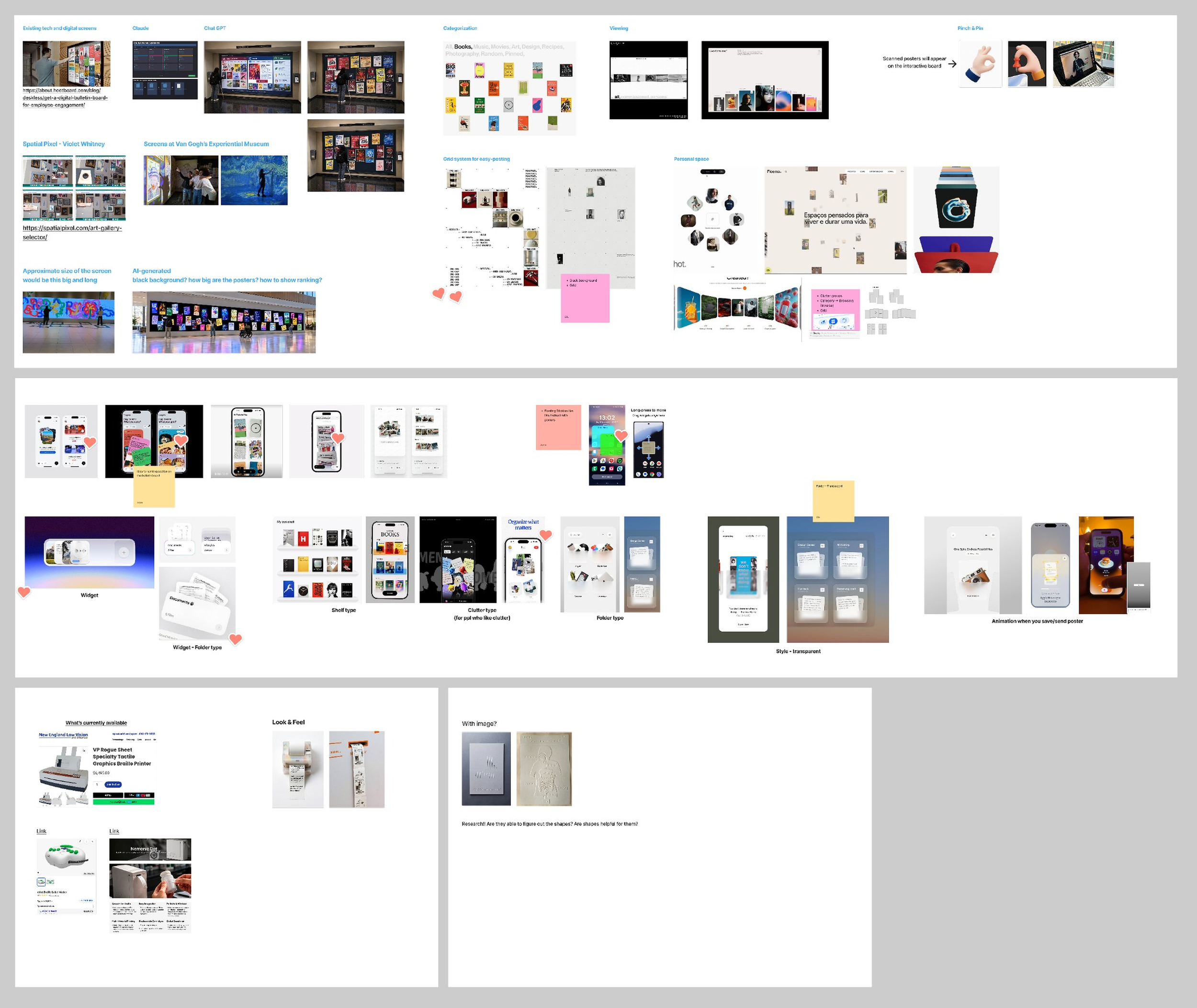
Visual Exploration and Design System
We explored different visual directions and interactions for the bulletin board, mobile widgets and braille takeaways. Our references ranged from interactive displays and gesture controls to poster organization, personal spaces and tactile printing.
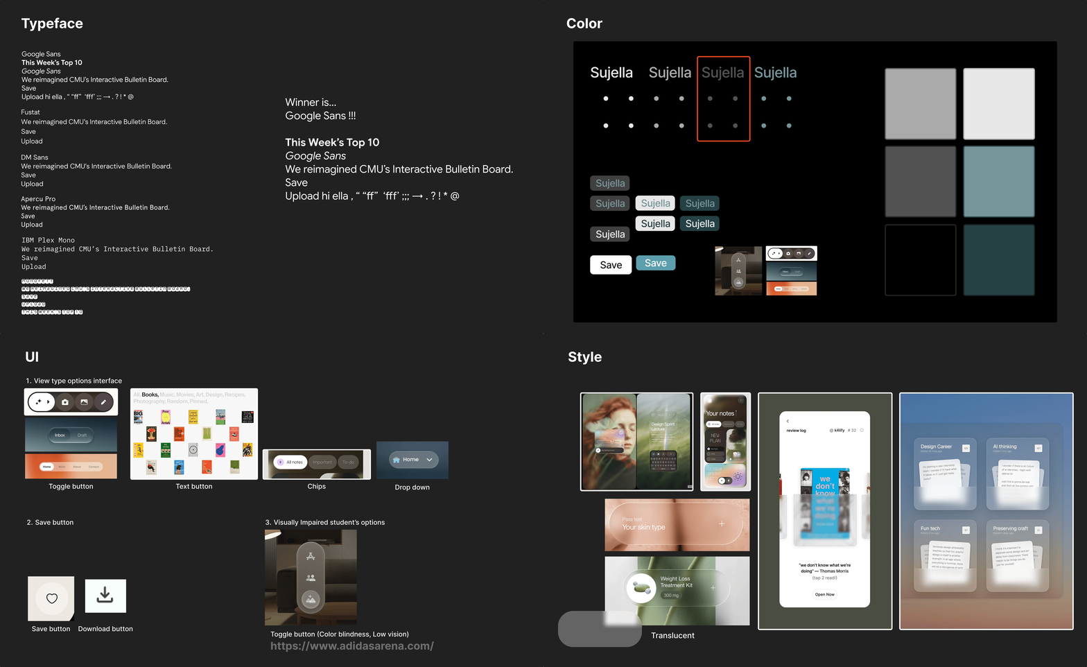
Before dividing the design work, we established a shared design system covering typography, colors, icons and interface controls. We explored typefaces with a range of weights and clear readability at different sizes, along with translucent surfaces that introduced depth while keeping background content subtly visible.
Our initial blue-green accent competed with the colorful posters, so we moved toward a monochrome interface that kept the focus on the content. We also refined smaller interactions, including bookmark icons for saving posters and simple controls for switching between viewing layouts.
What’s Next
Because the board is a proposed concept, our next step would be to test our prototype with students, including students with visual impairments, to see which interactions work and which do not. We would also look at how the experience holds up on busy days, when several people use the board at once, and ask facility staff how it would work in a crowded space.