PocketPal Book Design
Client: Sylvamo & Accent Opaque
Toolkit: Adobe Illustrator | Adobe Photoshop
Responsibilities: Cover Page Design, Layout Design, Presentation Design, Prototyping
Team: Aarohi Devasthale, Aimar Diaz Tata, Fon Limsomwong, Ching Cheung, Meghna Shourie, Min Kim, Sam Bird, Sarah Collins, Sneha Singh Nagar, Tia M. Dye, Vidisha Shah, Zhiyu Gong
Book Design & Print Production
SCAD partnered with Sylvamo / Accent Opaque to design the 22nd edition of the Pocket Pal, a well-known reference guide for professionals in the printing and design industry. Working in a team of 10 creatives, we collaborated closely with the client to reimagine the book for a contemporary audience while preserving its legacy.
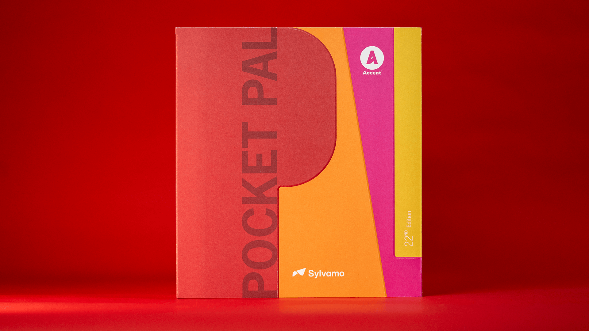
I designed the cover for the book and contributed to the visual direction of the project, ensuring the design reflected both the heritage of Pocket Pal and the modern identity of the Accent Opaque brand.
The final publication is now in print and available for purchase, bringing our work into the hands of designers and print professionals around the world. Seeing the book published, sold and reviewed within the design community was a rewarding reminder of the impact thoughtful design can have in print.
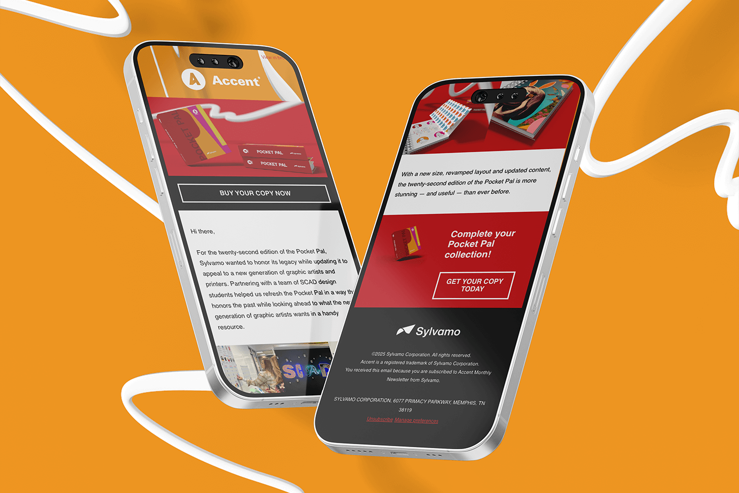
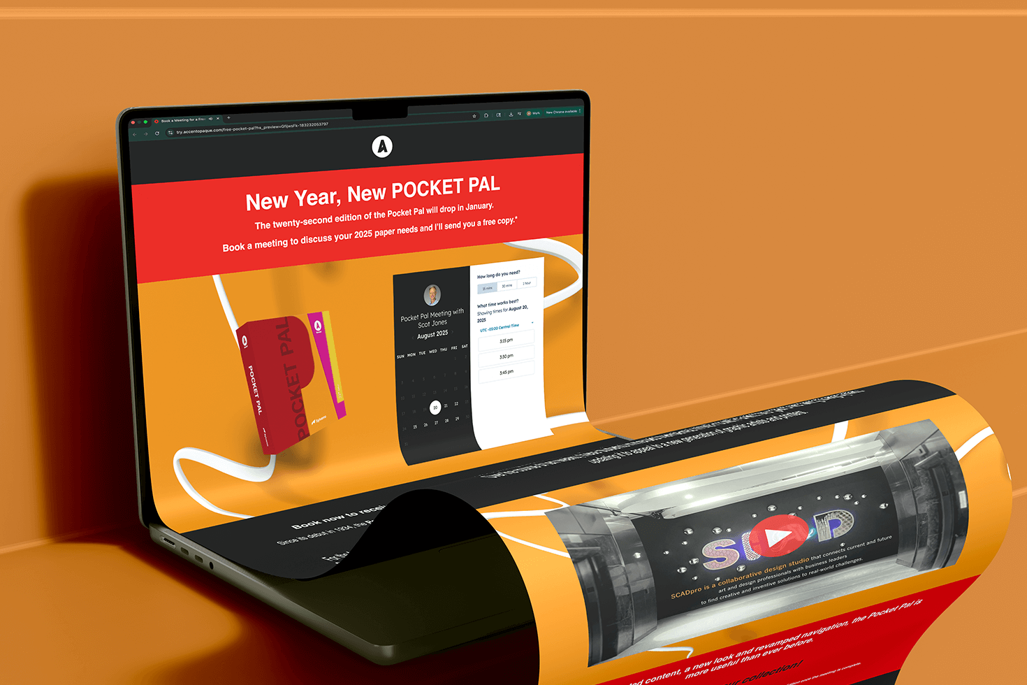
The launch campaign generated strong engagement across both digital and print platforms, resulting in hundreds of individual orders, over 5,000 unique email opens, and more than 1,000 website visits. The campaign also achieved a 6% sales meeting conversion rate, reinforcing the continued relevance of the Pocket Pal within the design and print community. It was exciting to see the redesigned publication connect with both longtime readers and a new generation of creatives through its refreshed visual direction and improved usability.


PROCESS
21st Edition
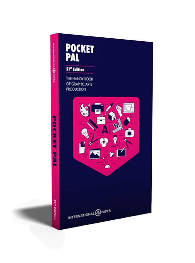
22nd Edition
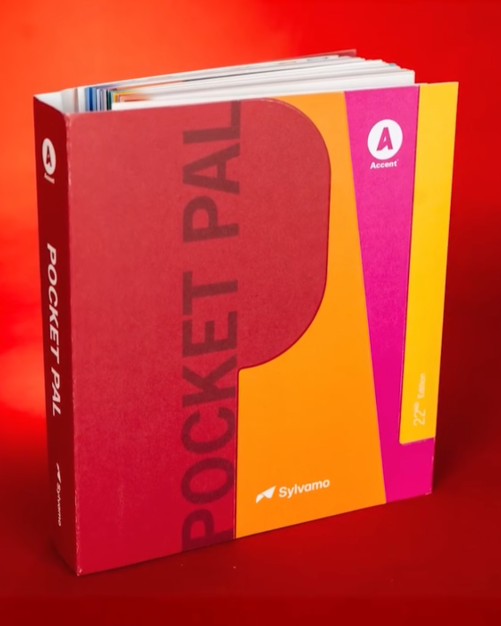
We were given access to previous editions of the Pocket Pal, which allowed us to evaluate what was working and what felt outdated. We reviewed and critiqued each edition to identify what elements and information could be retained and what needed to be reimagined. One key observation was the binding of the 21st edition, which made the book difficult to lay flat. While it served as a reference guide for designers and print enthusiasts, the usability was compromised, making it harder to interact with the content.
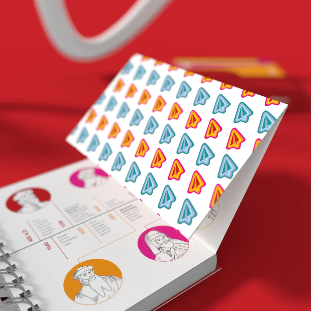
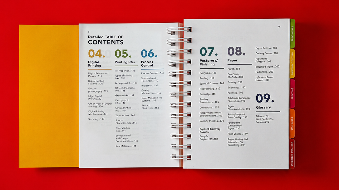
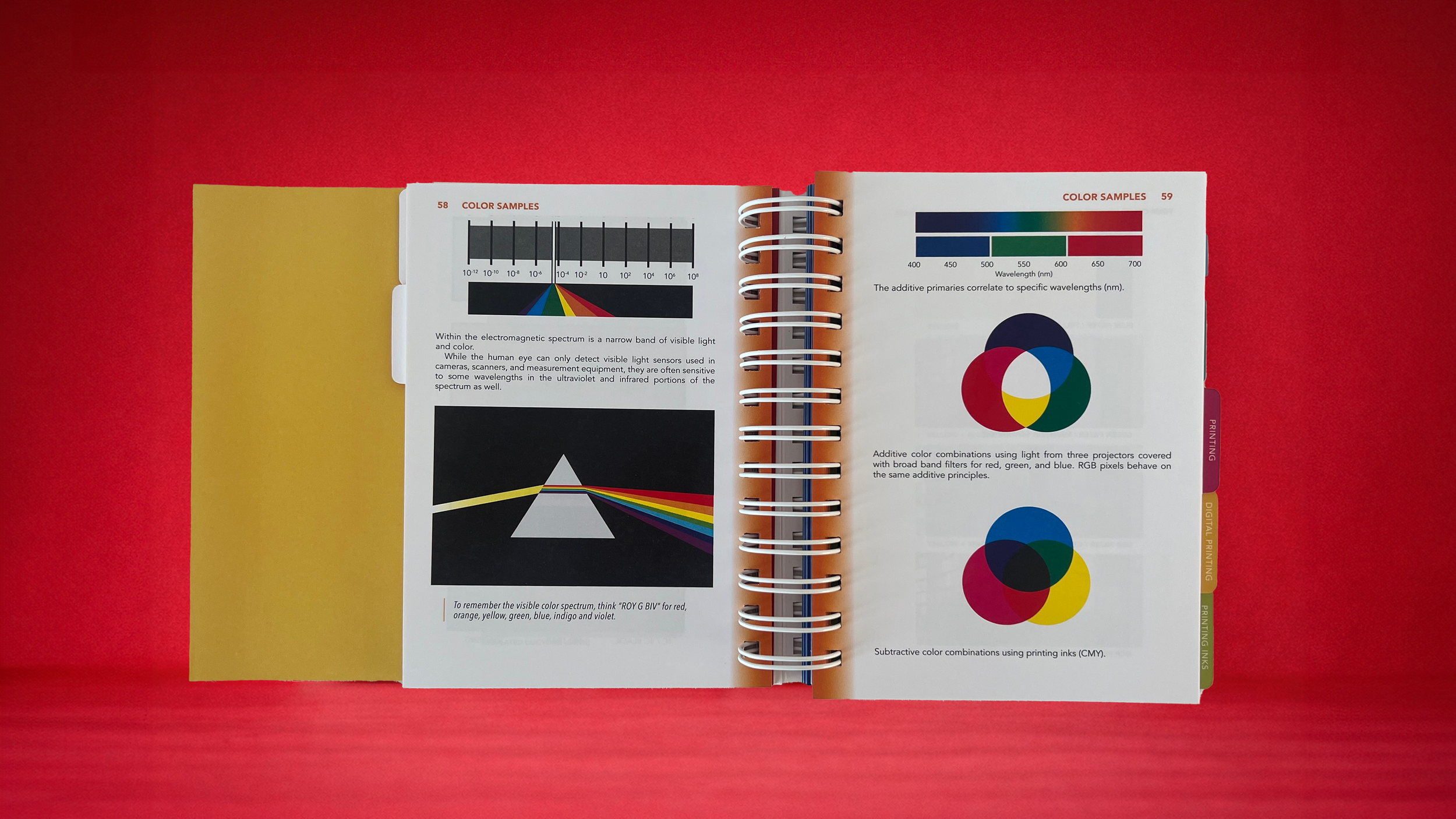
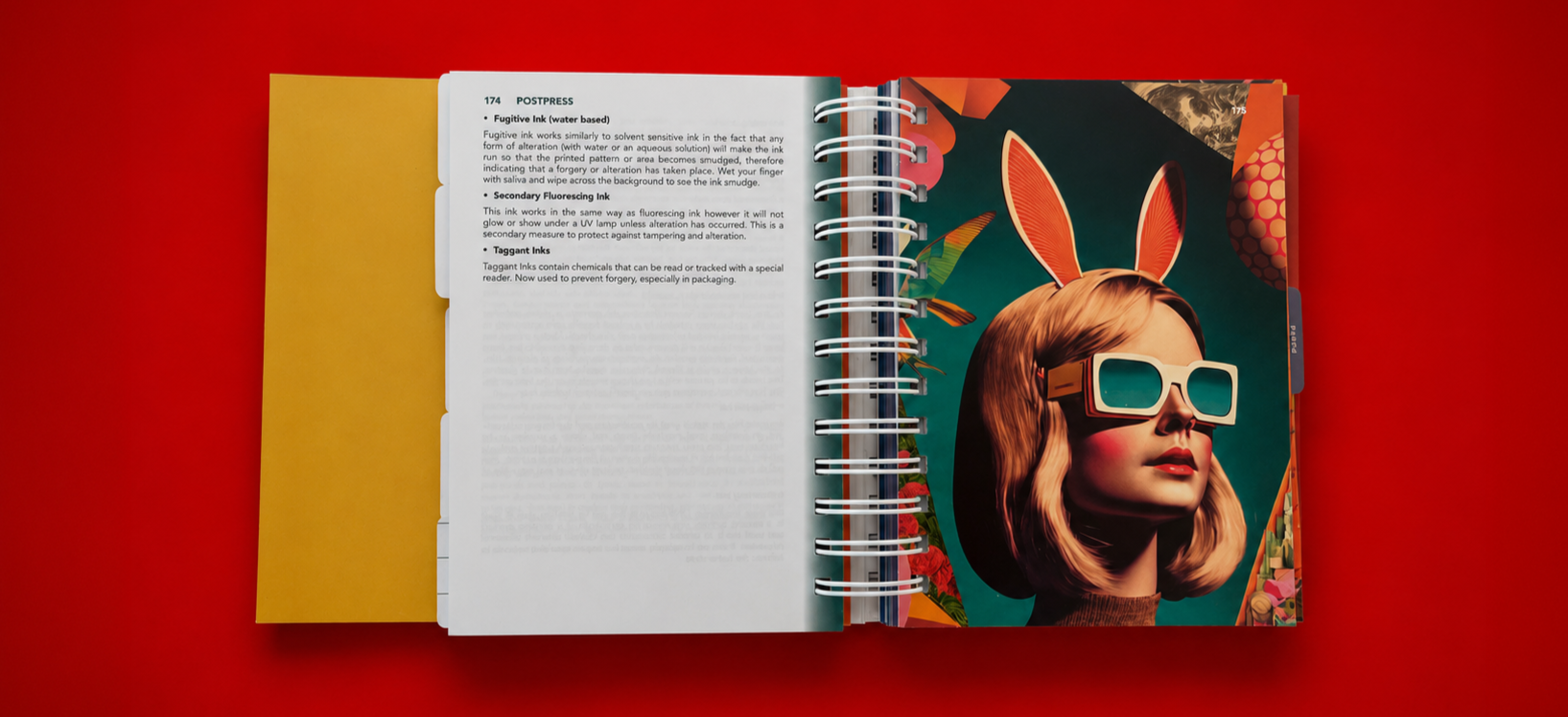
In response, the 22nd edition introduced a spiral bound format with a protective flap, improving legibility and ease of use while keeping the intended user in mind. Guidance tabs were incorporated along the right edge of the book to enhance navigation and allow readers to quickly move between sections. Outdated chapters referencing obsolete tools and software, such as floppy disks, were removed and replaced with more relevant content for contemporary designers. Information that could be better understood visually was paired with illustrations and interactive flaps throughout the book to create a more engaging and accessible reading experience.
Multiple cover directions were developed and presented to the client, each exploring different visual approaches to balance the legacy of Pocket Pal with a more contemporary identity. My direction was selected for the final publication.
Additional cover concepts by Aarohi Devasthale, Fon Limsomwong and Vidisha Shah
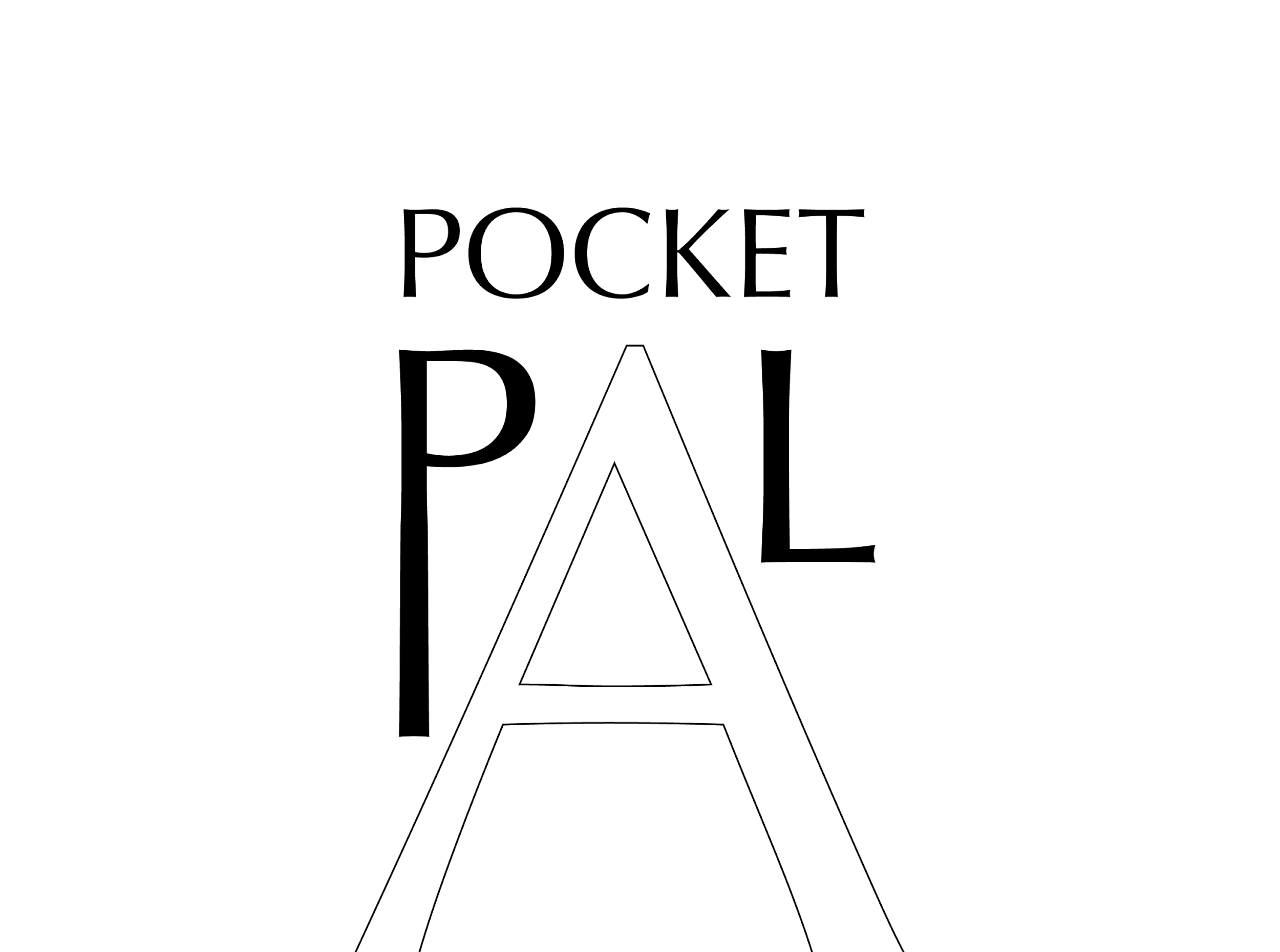
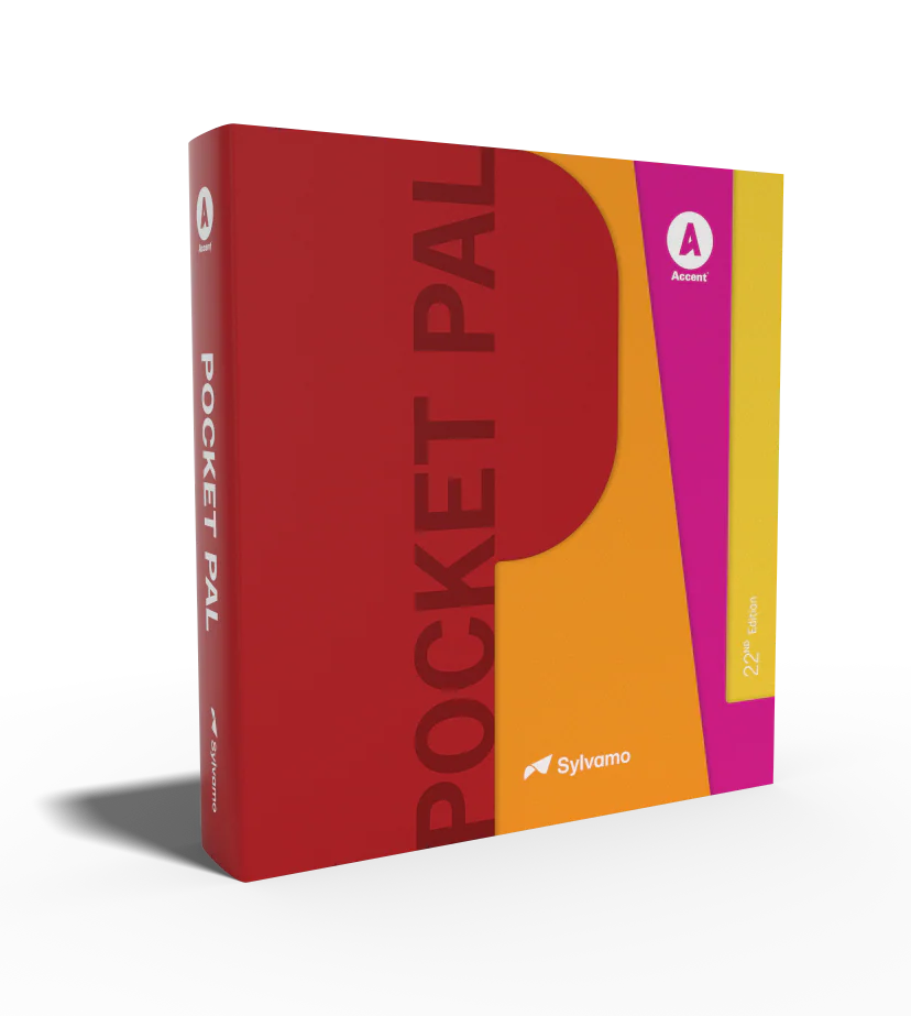
The final cover was developed through an iterative process, refining form, color and typography across multiple variations. A warm red palette was selected to create strong visual presence while drawing attention to the word “Pal,” reinforcing approachability and familiarity.
Early explorations included layered flap interactions across individual letterforms, but this approach was simplified to a single embossed surface for production feasibility and visual clarity. A friendly, highly legible typeface, New Gothic was chosen to balance the stylized horizontal composition and improve readability.