Team Summit
Event Brand Identity Design
Client: Georgia World Congress Center Authority (GWCCA)
Toolkit: Adobe Illustrator | Adobe Photoshop | Adobe AfterEffects, Microsoft PowerPoint
Responsibilities: Concept, Logo Design, Motion, Presentation Design, Site Assets, Typography
Team: Alisha King, Austin Simmons, Harriet Thomas, Jasmine Isom, Jayna Shah, Jen LeMaster, Holly Richmond, Randy Leiberman, Samantha Joiner.
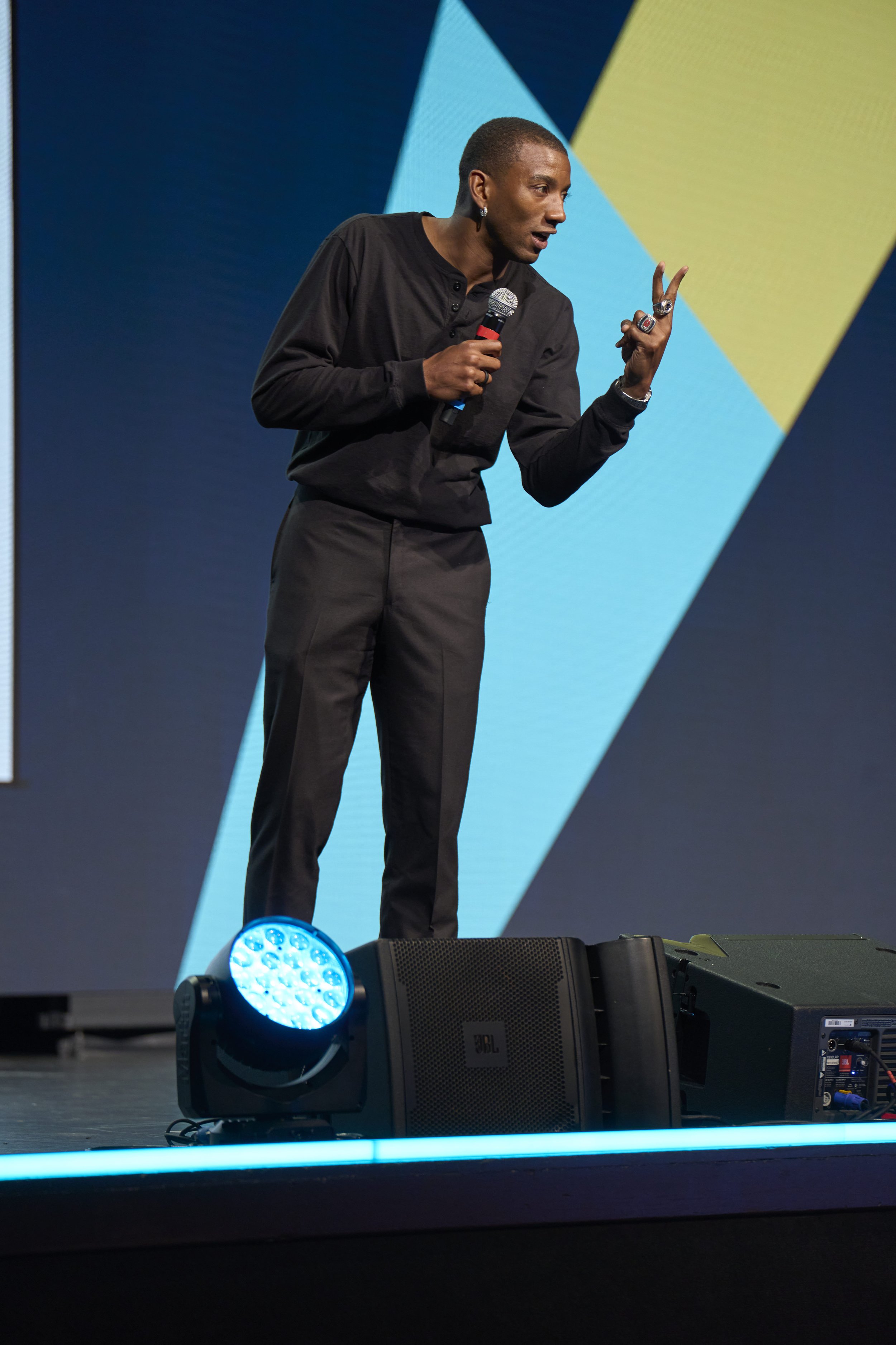
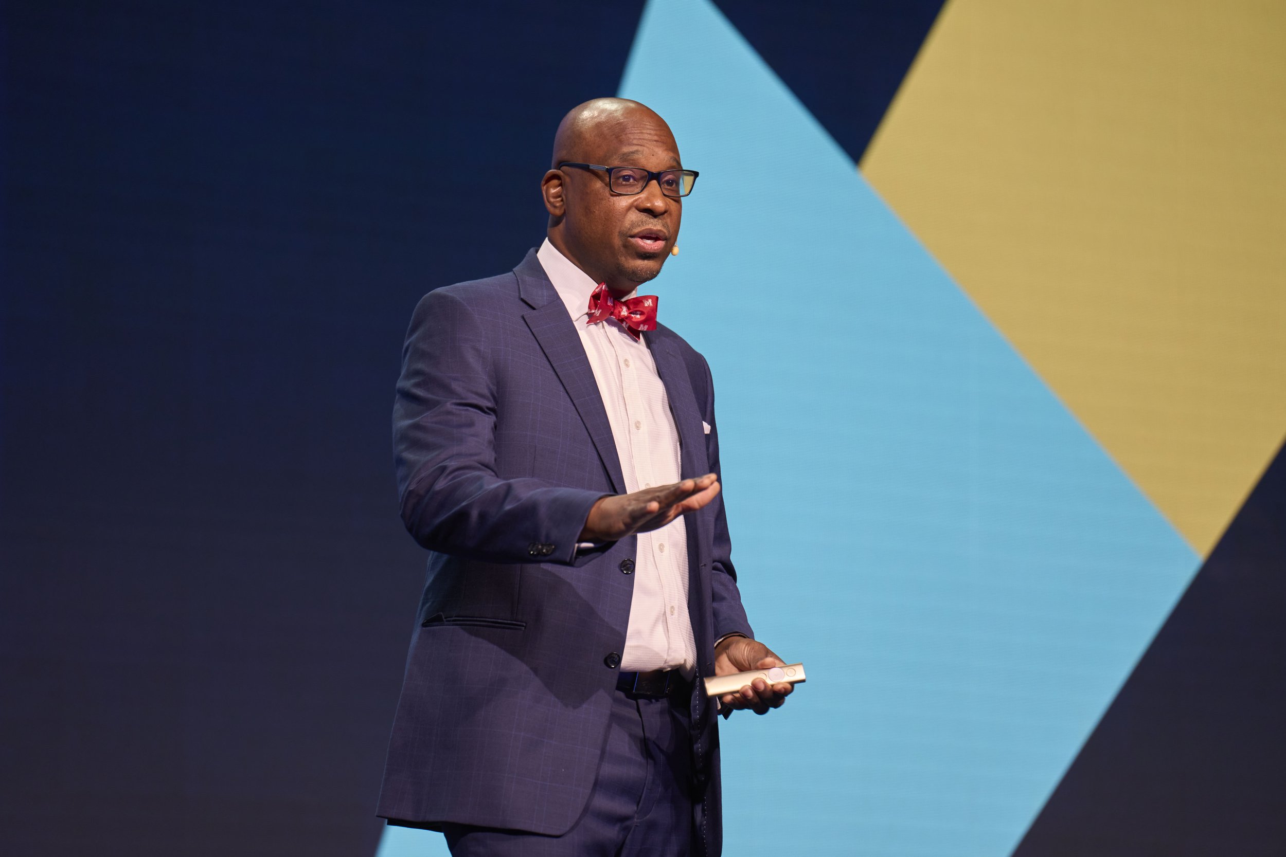
The Georgia World Congress Center Authority (GWCCA) is a premier convention center in Atlanta that welcomes over a million visitors each year. Team Summit, GWCCA’s annual one-day leadership event for employees, promotes growth and provides resources for both personal and organizational development under the theme “Unconventional Leaders.”
The event’s identity system reached more than 500 employees and encouraged participants to step beyond their comfort zones and celebrate their individuality. GWCCA’s goal was to build confidence in employees to embrace difference and lead boldly. This message was communicated through an innovative visual identity that blended photography with graphic elements to create a cohesive, expressive experience aligned with the summit’s spirit.
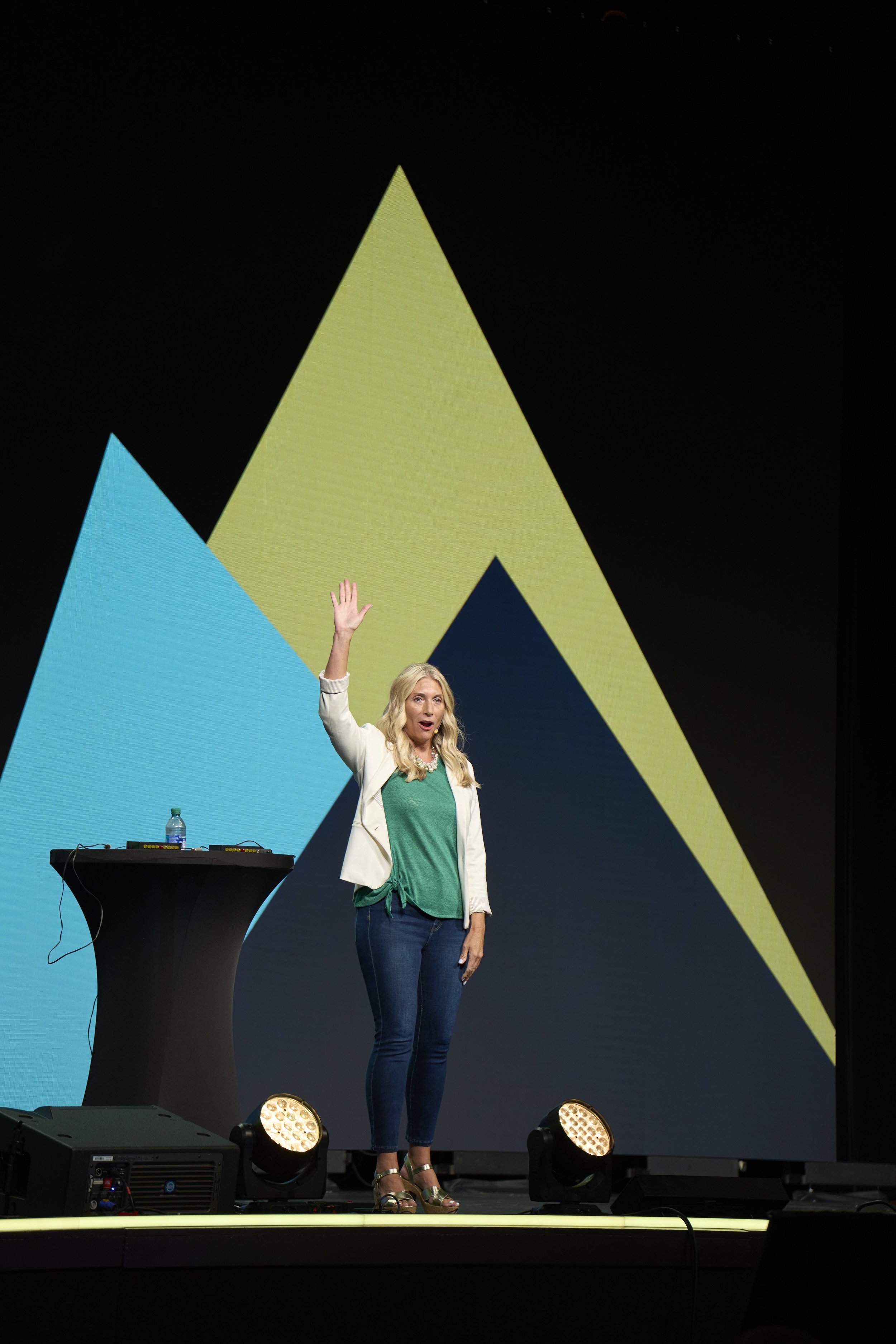
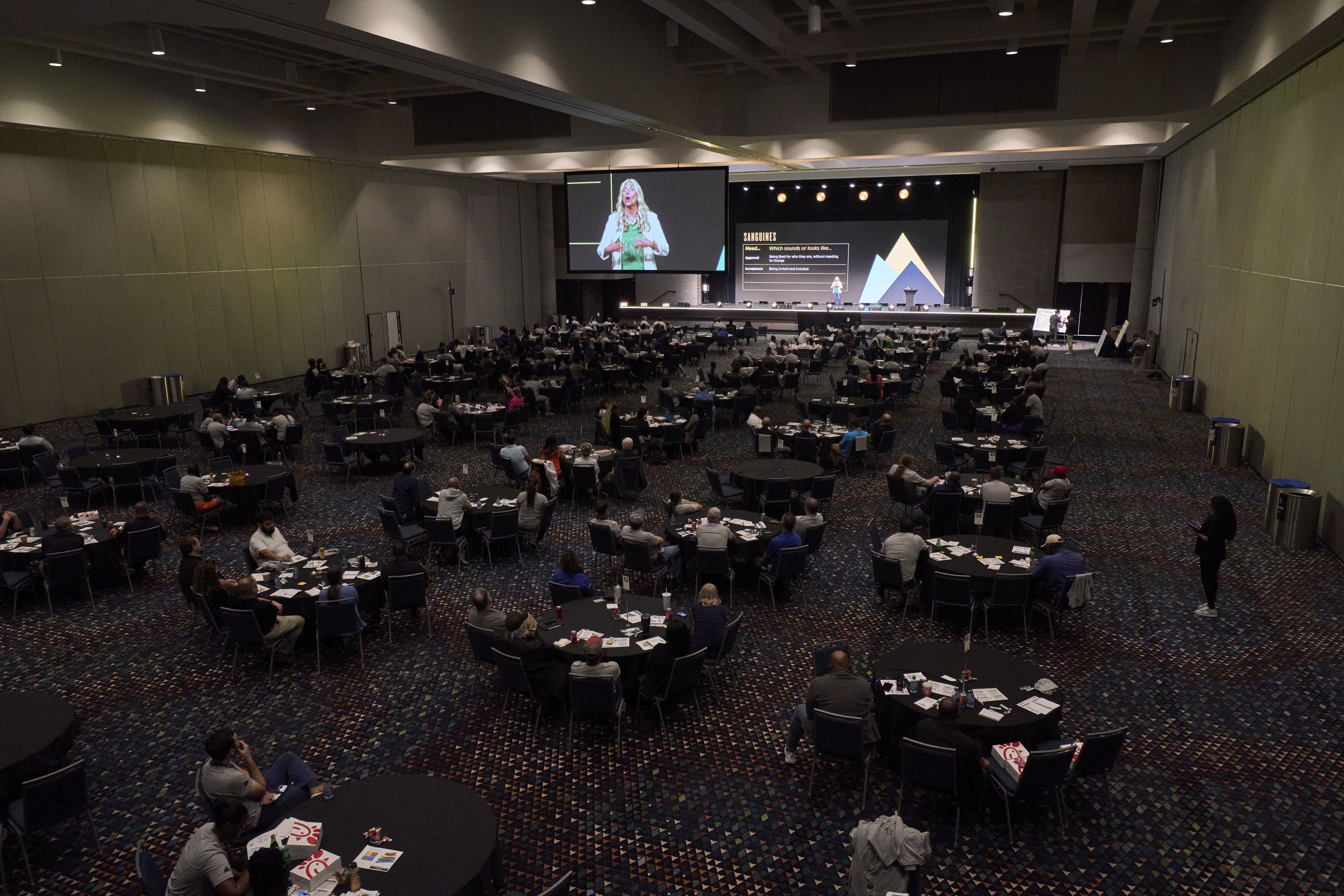
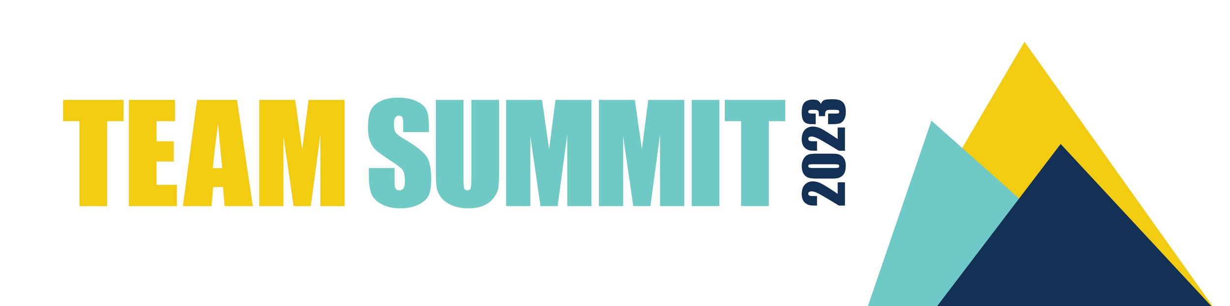
The logo for the 'Team Summit' event aligns with its name, emphasizing peaks and goals. The triangular arrangement of peaks symbolizes the possibilities that open up when one dares to be bold and courageous. The tagline, 'Unconventional Leader,' informs the asymmetrical composition and alignment of the mountains.
The color palette, incorporating blues from GWCCA's branding and adding yellow for enthusiasm, motivates employees. This design encourages a sense of adventure, daring individuals to embrace an unconventional leadership style and reach new heights.

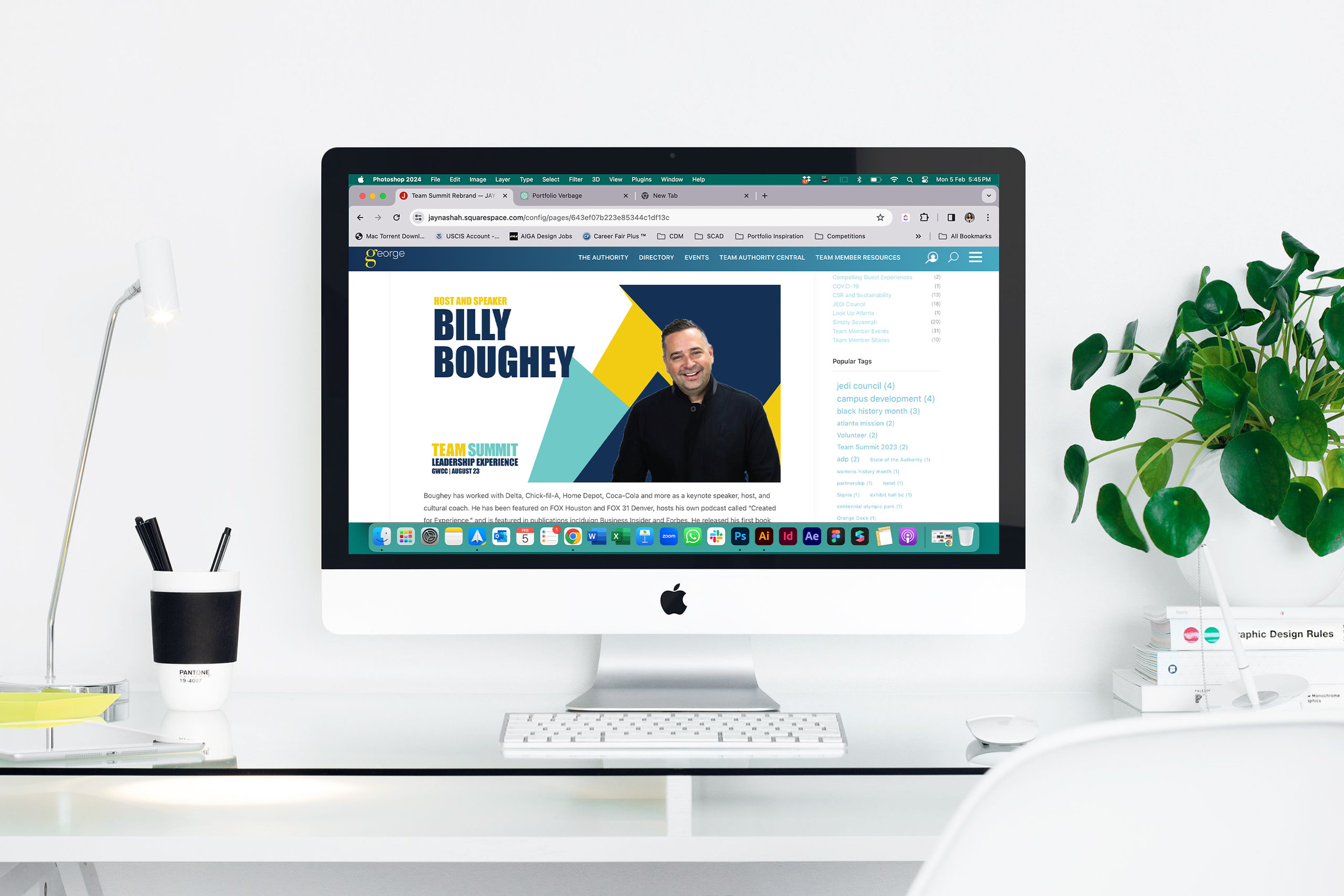
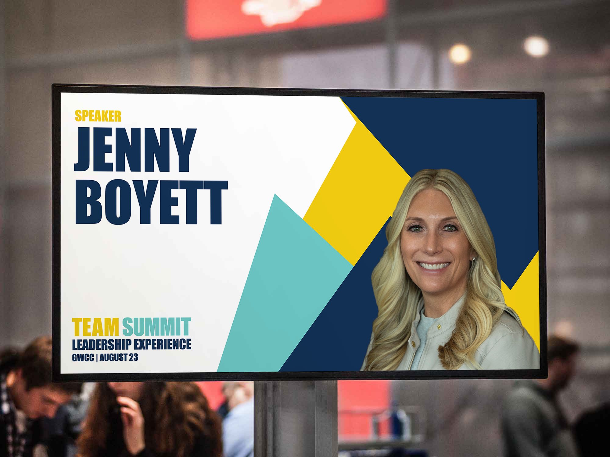
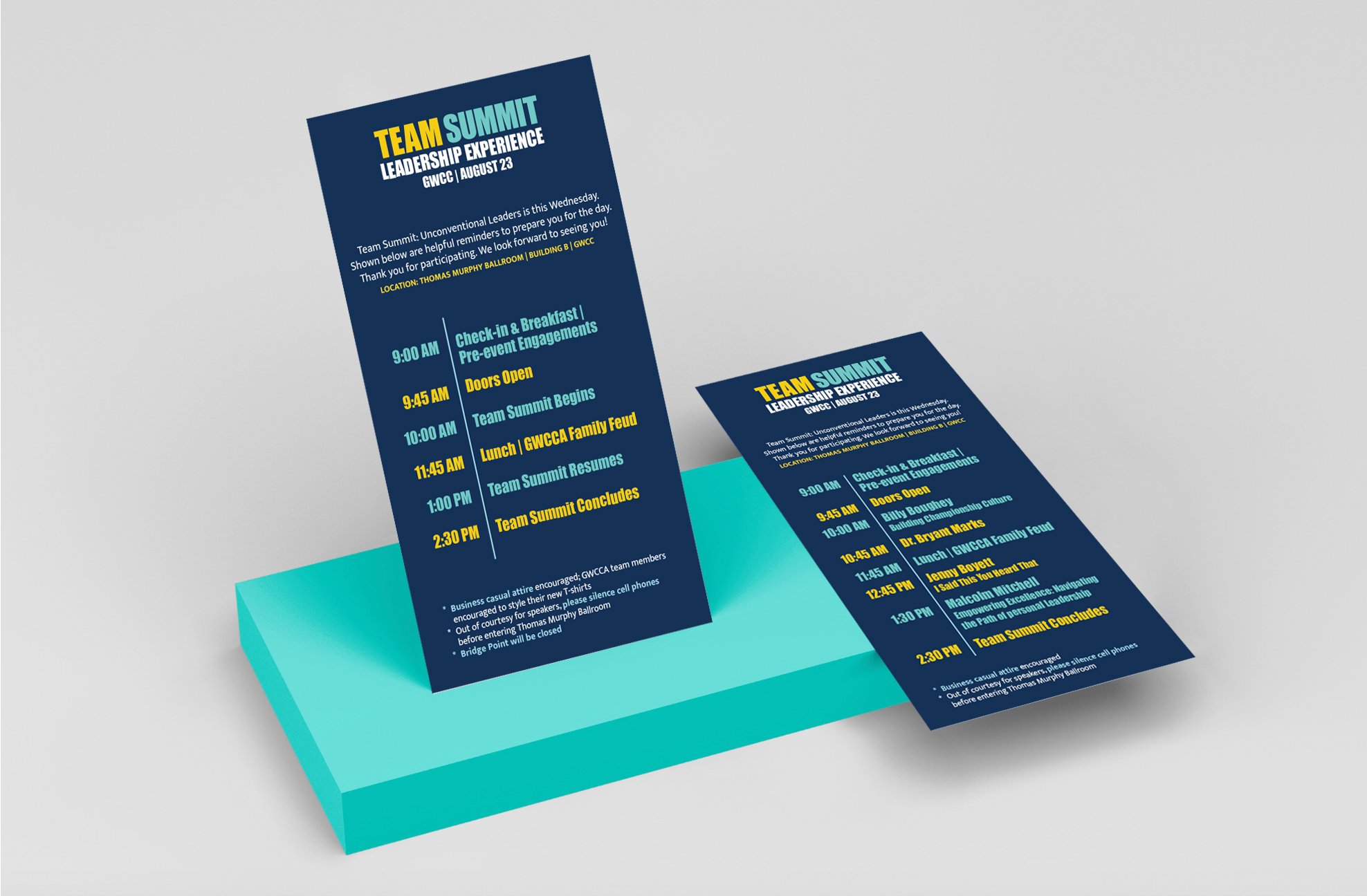
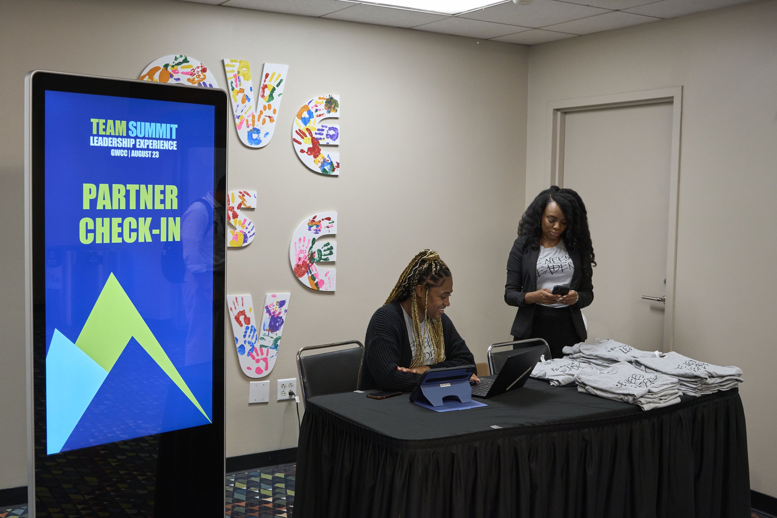
The extended visual identity system seamlessly integrates a variety of touchpoints, including email announcements and signage screens in GWCCA, keeping employees informed about speakers. "Know Before You Go" materials were distributed to both GWCCA team members and external stakeholders who were present during the experience.
Banners and signage were strategically placed at registration counters where event T-shirts were distributed. This cohesive approach ensured a consistent and impactful brand presence across various channels and mediums.

In addition to designing touchpoints, the slide deck was crafted with careful consideration for the ballroom's space, lighting, and size. The mountains from the logo were scaled and strategically placed on the right side of the screen, allowing speakers, who predominantly delivered speeches from that area, ample space on the left for presenting their content. This layout ensured a harmonious presentation, emphasizing the message and reinforcing the branding without any visual distractions.